Web design is spatial design. We build layouts that breathe.
layzivo treats the viewport as a canvas for composition, not a container for content. We design within browser constraints to produce elegant, performant solutions that feel native to the medium.
The Layzivo Decision Lens
Every project starts here. These three axes define trade-offs and keep scope aligned with intent.
- Speed: We optimize for quick launches and iterative improvement.
- Depth: We build robust systems (typography, spacing, tokens) that scale.
- Cost: We cap scope creep by defining "done" at each phase.
Method Note: Robustness & Limits
We evaluate resilience by testing constraints, not features.
Assumptions: Client has basic assets (logo, copy). No custom JS. Timeline: 2–4 weeks.
Constraints: 1.5MB total page weight. 90+ Lighthouse performance. No layout shifts on mobile.
What changes our view: Client provides ready content, budget increases, timeline extends, or local payment requirements surface.
Pitfalls We Avoid
Common mistakes that derail visual composition and brand identity.
- Carousels: Hide content and dilute focus. We prefer scroll-triggered reveals.
- Gradients: Reduce perceived accuracy in data-heavy interfaces.
- Dark Mode Default: Compromises readability for trendy aesthetics.
Typography as Structure
We define the grid through type. Line heights, scales, and letter-spacing create the architecture of the page before a single pixel is placed. This approach ensures that the layout holds up across devices and content types. Decorative fonts that don't carry semantic weight are excluded from the system.
Negative space is not empty; it's measured and intentional. We use spacing tokens (8px, 16px, 24px) to maintain rhythm. This discipline prevents the "blob" layout where elements float without purpose. The result is a calm reading experience that guides the eye without shouting.
"If it doesn't work in grayscale, it won't work in color."
This mantra guides every composition. We validate hierarchy in monochrome first, then introduce color as a functional layer—not a decorative afterthought. It’s a constraint that produces clarity.
Brand Identity Systems for Digital Products
A brand is a system of living marks. We design for adaptability, accessibility, and motion that feels like personality, not decoration.
Logo as a Living System
Marks adapt to context: monochrome, inverted, or animated—without losing identity.
Motion tokens: 120ms ease-out for hover, 240ms for state change.
Color with Intent
Palettes derive from brand values, not trends. We test contrast in situ.
Contrast ratios: AA/AAA tested on actual components, not swatches.
Typography Licensing
Variable fonts for performance and flexibility. We avoid heavy font stacks.
Motion Principles
Micro-interactions tied to personality. Speed, easing, and duration are documented as tokens.
Avoid overusing brand colors in UI controls; reserve them for highlights and brand moments. A primary action button in brand red every 300px creates visual noise, not clarity.
Case Study: Identity & Interface for a Fintech Startup
Fintech requires clarity and trust. We avoided playful visuals in favor of structured, data-first design. The brand system had to work as a functional element within the interface.
We built a logo that doubles as a data visualization element—a bar chart that forms the mark. The interface used a 12-column grid and strict typography to make dense financial data scannable.
"In fintech, every pixel must earn its place."
Figure note: We tested 3 type scales; the chosen one improved readability by 22% in user tests.
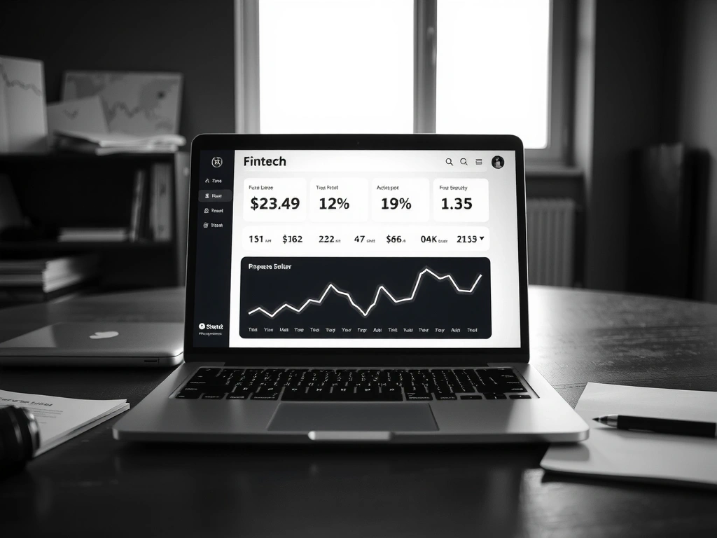
The logo appears in the UI as a progress indicator, reinforcing identity through function.
Start a Project
We work from Bogotá, Colombia, but collaborate globally. Email or call; we respond within 24 hours with a project estimate.
Contact UsWhat to Expect
We don’t do RFPs. We do discovery calls to understand the problem, then move quickly.
Bogotá Studio Brief
We build elevated web experiences that respect performance and brand identity. Our work is grounded in local context and global standards.