From Wireframe to Launch: The Layzivo Method
We treat every project as a continuous loop, not a linear checklist. Discovery feeds Build, and Build informs the next Discovery.
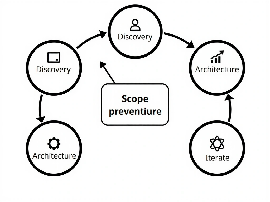
Figure Note
This model loops back from 'Launch' to 'Discovery' immediately. It treats a website as a living asset, not a finished brochure.
Input: Reality
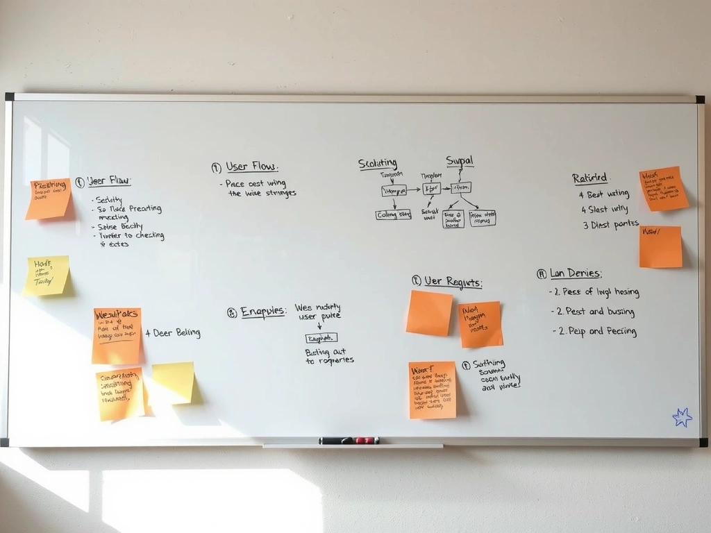
Raw notes, sticky notes, and conflicting stakeholder ideas.
Output: Clarity

Translation: From messy reality to a clear, clickable digital path.
Decision Lens: Process Rigor
Prevent scope creep before visual design starts.
Budget adherence and timeline predictability.
Speed in week one (saves weeks in month three).
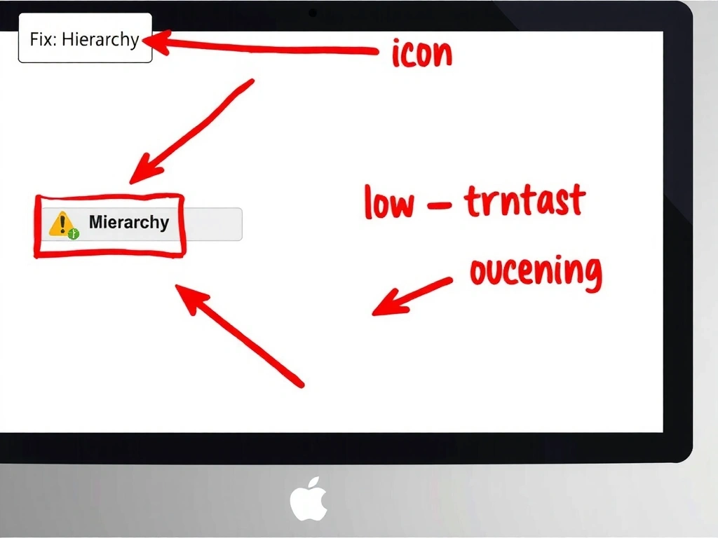
The Interface Audit: Pre-Mortem for Your UI
We audit for UI Debt—the accumulation of small, invisible inconsistencies that erode user trust. Before we write a line of code, we map every element to a strict 8px grid. If it doesn't align, it doesn't ship.
- False Affordance: When an element looks clickable but isn't. We flag these as conversion killers.
- State Hesitation: Buttons that don't clearly signal "active" create micro-friction.
- Cognitive Load: We map features to user priority, cutting the bottom 20% that distracts.
Method Note: Evaluation
We evaluate every UI decision against a "robustness threshold." Does this component hold up under rushed user input? Does it break with a screen reader? We stress-test for failure modes, not just ideal states. The risk isn't aesthetic; it's operational. A confusing interface increases support tickets and returns.
Full-Stack for Designers: The Technical Handoff
The handoff isn't a file drop; it's a collaborative review. Developers are in Figma during the final design stages. We don't use hex codes; we use tokens.
Performance Budget: Set at the design stage. We don't design animations we can't ship at 60fps. The final deliverable is a living style guide, ensuring your team can update content without breaking the design.
Trade-off Frame
Glossary (Studio Stance)
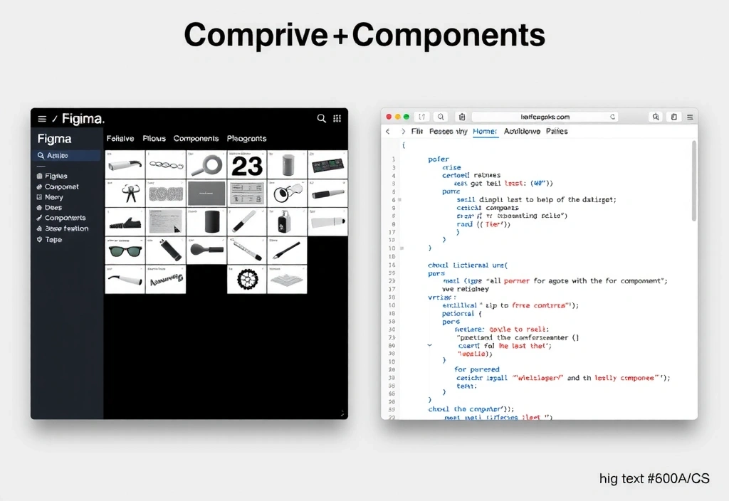
One Token. One Component.
"A B2B SaaS startup needs to update pricing. Their marketing lead logs into the CMS, changes a value, and the layout breaks."
Our Fix: The style guide includes container rules. Pricing tables snap to grid regardless of text length.
Bogotá to the World: Remote-First Operations
Our studio on Carrera 11 is the hub, but our process is built for async global collaboration. We operate on a "follow-the-sun" model for critical path tasks. Communication is documented, not ephemeral.
- Overlap Window: 2 hours daily for US/EU syncs.
- Tools: Read access to Jira, Figma, docs.
- Constraint: No decisions via Slack DM.

Have a specific constraint or timeline in mind?
Initiate a Studio Briefing