The Layzivo Portfolio:
Solved Problems, Not Just Screens.
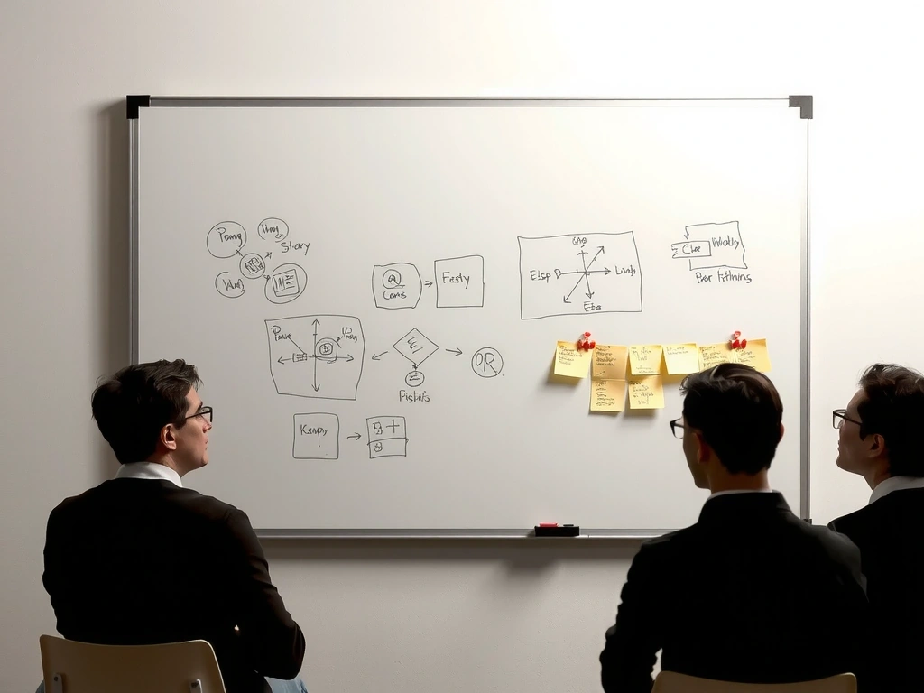
We don't design interfaces in a vacuum. Each project in this curation represents a specific business constraint, a user friction point, or a technical hurdle. This is the story of how we moved from chaos to clarity, starting with a fintech dashboard that needed trust more than it needed flash.
Constraint: The 8-Point Grid
On the Apex project, the client's legacy data was chaotic. Vertical rhythm was impossible until we imposed a strict 8-point spacing system. It wasn't aesthetic preference; it was the only way to make dense financial data scannable without increasing cognitive load. We don't apply this because it looks "clean"—we apply it because it prevents user error.
"The client needed trust, not flash. Flashy interfaces feel unstable. Calm interfaces feel accurate."
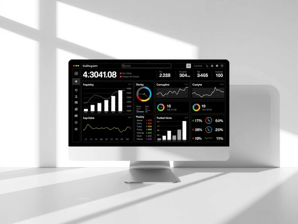
Scenario: The First 30 Seconds
Old Site: A user lands. They see 14 menu items. They search for "profit" and get 40 unsorted results. They bounce.
New Site: A user lands. They see a single KPI: "Net Profit." A subtle micro-interaction confirms the data is live. They stay.
Translating Sensory Atmosphere into Digital Surface
While data interfaces demand clarity, hospitality demands feeling. The challenge for Casa del Sol—a boutique hotel in the Colombian highlands—was capturing the texture of their physical space. The scent of eucalyptus, the weight of linen, the sound of the courtyard. You cannot ship scent over the web, but you can design the pause before the booking.
The 70% Mobile Constraint
- Thumb-reach zones for all actions (no hover states)
- 3-field max checkout (Name, Dates, Payment)
- Full-bleed imagery that loads instantly on 4G
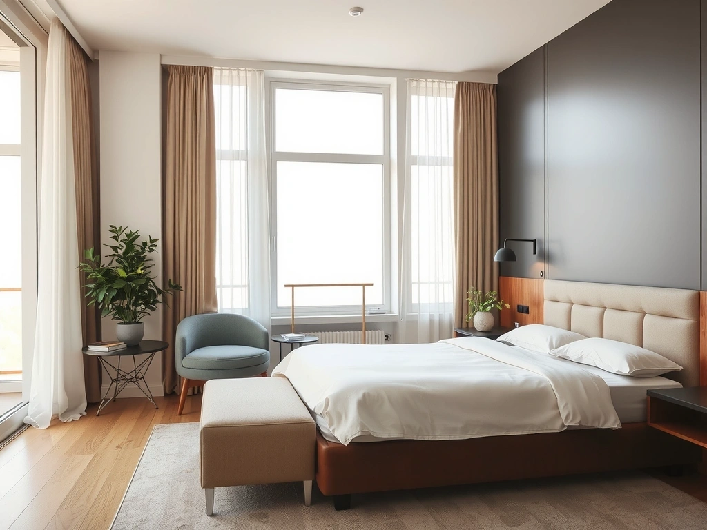
Translating Texture: Photography acts as the proxy for physical material. We use light and shadow to imply touch.
The Booking Flow: Minimal fields, maximum breathing room. The paper texture is a tactile nod to the hotel's stationery, grounding the digital in the physical.
The Layzivo System (LDS)
Rigorous logic for scalable beauty.
42 Core Components / Variable Font Architecture / State-Driven Color
Atomic Components: States & Spacing
Button
Form Field
Card Surface
Icon Stroke
Don't: Chaos
Inconsistent spacing (4px, 6px, 11px). Multiple border weights. Unaligned text baselines. This creates cognitive friction. Users subconsciously distrust interfaces that look "broken" or "hacked together."
Do: System
8-point grid enforced. Border weights defined (1px, 2px). Typographic scale locked. The interface feels engineered. This stability allows the user to focus on the content, not the chrome.
"A design system isn't a rulebook. It's a product for the people who build your products."
Future-Proofing: Motion & Access
Good design doesn't sit still, but it doesn't dance without purpose. Our motion principles are strictly functional: guiding focus, confirming actions, reducing perceived latency. Combined with a WCAG AA accessibility mandate, we ensure the work works for everyone, on any device.
              <button aria-label="Close Menu" data-action="modal.close">

                <svg aria-hidden="true">...svg>

              button>
Purposeful Animation
We design the "in-between" states. The shapes above represent the elastic logic we use to guide the eye without distracting it.
Ready to Build?
This portfolio is a snapshot. Your project is the next chapter.
Start a Conversation